Custom Dashboards reference

Uses: Advanced Analytics
Related Documentation
OpenAPI Specifications
Incompatible with
on-prem

Custom Dashboards provide a flexible way to build, organize, and manage analytical views that are tailored to your organization’s needs. This functionality is available in Konnect Analytics.

With Dashboards, you can create custom dashboards either from scratch or from a template, and modify them from Konnect.

Templates

Templates are best-practice presets created by Kong. You can use them as a starting point when creating analytics views and dashboards.

Template

Description

Quick summary dashboard High-level overview of your organization’s API traffic and performance. This dashboard highlights the top Gateway Services, Routes, and Consumers across your Konnect organization with time-based trends for key performance metrics. It surfaces critical bottlenecks in the slowest Services, Routes, and Consumers, helping you identify areas that may need optimization.
AI gateway dashboard AI-focused insight into your LLM traffic and operational costs. Track request volume by model and provider, understand token usage trends, and monitor latency across different models. This dashboard helps teams operating AI gateways to optimize performance and manage costs with visibility into traffic patterns and provider-specific behavior.
Shared services dashboard Health and performance of Gateway Services managed inside your Konnect organization. This dashboard focuses on golden signals such as latency, error rates, and throughput, alongside detailed breakdowns of 4xx and 5xx responses, failed authentications, and rate limit hits. It provides a clear picture of how your Services are behaving, including which Consumers and Routes are most active or error-prone.

For more information, learn how to create a custom dashboard from a template.

Tiles

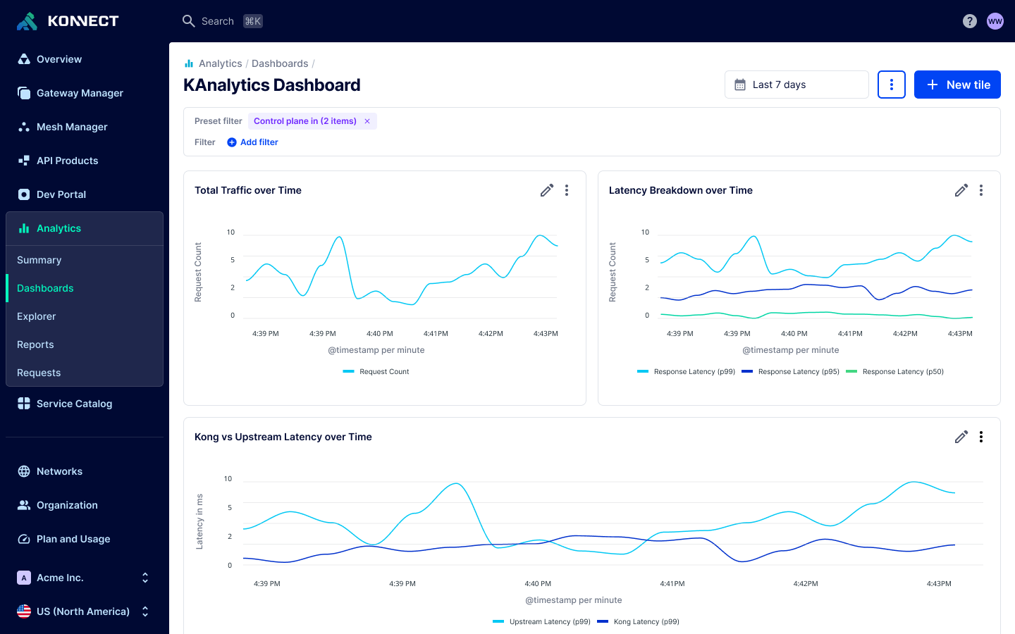
Tiles represent charts that you can add to your Dashboards. You can create new chart tiles from scratch or add a tile from an existing report.

To add a new tile, select New Tile from the view. After selecting from a series of charts, you’ll be taken into a chart editor similar to the Explorer experience, where you can adjust the chart until it shows what you need.

In the Edit tile view, you can:

  • Choose a chart type, such as time series line, bar, donut, or single value.
  • Add filters to narrow down the data shown in the chart.
  • Name the chart tile.
  • Decide whether the chart should:
    • Use the global dashboard time range (automatically updates if a viewer changes the dashboard time), or
    • Use a fixed time range that always applies to this specific chart, regardless of dashboard-level settings.

If a dashboard-level filter is applied, it also applies in the Edit tile view and is shown in the Dashboard filters section.

Be careful: These filters only affect the chart’s data as long as they remain applied to the dashboard. If someone removes the dashboard filter, the chart will no longer be filtered by it.

You can also add a tile by selecting an existing report, which lets you reuse previously created analytics configurations as dashboard tiles.

Each tile is customizable from the Edit tile view. You can choose the data source (API Usage or LLM Usage), change the type of chart, change the dimensions, add filters, and update other configuration to control the display of the tile. For more information on creating custom dashboards, review the how-to on creating custom dashboards.

Filters

Custom Dashboards support dashboard-level filters that apply across all tiles in a dashboard. Filters help users narrow down the data shown in charts without modifying individual tiles.

All users can add temporary filters, which apply only for the duration of the session. These filters allow users to explore data dynamically without changing the dashboard for others. Users can bookmark the page to return to a specific set of filters.

Admins can define preset filters when creating or editing a dashboard. Preset filters persist across sessions and are applied for all users viewing the dashboard. They are useful for:

  • Ensuring viewers only see data they are authorized to access.
  • Avoiding repetitive filter configuration across individual tiles.

Preset filters appear as badges at the top of the dashboard. Viewers with “Viewer” access can see these filters but can’t remove them. A lock icon indicates that the filter is preset and enforced. Hovering over the badge reveals the filter values for additional context.

Example of a preset filter

Figure 1: An example of a preset filter

Role-based access

Organization Admins can control who is allowed to view a custom dashboard. This is currently the only available permission level—there are no editor or owner roles beyond the original dashboard creator.

To manage dashboard visibility, Organization Admins can assign roles to users through Organization > Users in Konnect, using the Role Assignments tab. Only users with the appropriate roles will be able to access dashboards that are restricted to specific teams or audiences.

Permissions

For more details, see the teams and roles documentation.

Action

Org Admin

Dashboard Viewer

View dashboard
Create dashboard
Edit dashboard
Delete dashboard

Dashboard permissions only control access to the dashboard object. Access to the underlying data sources (such as a control plane) is enforced separately.

A user may be able to open a dashboard but see empty or partial results if they lack permissions for one or more of its data sources.

Roles

Users with the Dashboard viewer role can access dashboards shared with them, interact with charts, and apply temporary filters; but cannot create, edit, or delete dashboards. Organization admins can use this role to manage the content that is visible to specific users.

The following describes the predefined roles for Analytics:

Role

Description

Dashboard viewer Users can view the Analytics summary and report data.
- Cannot edit dashboards
- Can apply temporary filters during a session
- Can only see dashboards they are explicitly granted access to

Automation

Custom Dashboards can be managed programmatically to support automation and version control.

There are two primary ways to automate dashboard creation and updates:

  • API + JSON definition: Use the Konnect API along with the Export JSON definition option available in the UI. This option provides the full dashboard definition in JSON format, which you can modify and use in API calls to create or update dashboards programmatically.

  • Terraform: You can use Terraform to define and deploy dashboards as code, making it easier to integrate dashboard configuration into your infrastructure workflows.

These methods enable teams to standardize dashboard definitions, apply changes across environments, and maintain dashboards in version-controlled repositories.

Something wrong?

Help us make these docs great!

Kong Developer docs are open source. If you find these useful and want to make them better, contribute today!